Times inevitably change, and with them, so do aesthetics; be that musical, cultural or visual, and nowhere else is it more apparent than in the media phenomenon of the remake/reboot. The basic idea is sound on paper, take what made the content initially successful and update it to the current time frame. Sounds simple enough, right? Well, as it turns out, there’s much more to rebooting or remaking a game than simply making it look shinier smoother; updating character designs, soundscapes and music, all of which were part of what contributed to the original’s success. Sometimes this proves to be a success…other times, not so much. So in this article, we will look at five characters from gaming remakes/reboots and see how they updated the aesthetic and if it was a success.
Kratos: God of War (2005) vs God of War (2018)
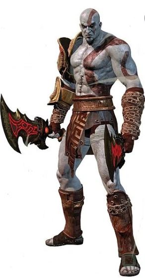

Starting off topical, given that his newest instalment is on track to release soon, Kratos of the God of War series looks and feels remarkably different between his 2005 and 2018 appearances. The 2018 game of the same name shares the interesting status of being a reboot of the series and a sequel to the original series. Kratos’s look has gone from a fairytale interpretation of a Greek Demigod wielding fanciful weapons to a much more grounded design to fit the more grounded gameplay and tone of the 2018 game. Sporting a lumberjack beard, leather chest armour and full trousers compared to the pointy chin and spartan war skirt of old, Kratos is older and more aware of his surroundings. His design has grown up, much like those who originally played the 2005 game.
Jill Valentine: Resident Evil 3 (1999) vs Resident Evil 3 Remake (2020)
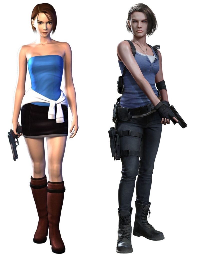
20 years can do a lot for a person’s sense of fashion, and Jill Valentine can attest to the fact that club attire is not the best thing to navigate a Zombie apocalypse. While Jill maintains the same colour scheme of her original solo outing into the survival horror series, it has become much more functional with jeans, a t-shirt and numerous straps and holsters to carry her plethora of zombie-slaying weapons. This gets at the heart of the Resident Evil Remake series, maintaining the story’s core and characters while updating away from the more poorly aged elements. It carries the B-movie vibe while still being able to tell a story, from looks to music.
Brendan and May: Pokémon Ruby/Sapphire (2002) vs Pokémon Omega Ruby/Alpha Sapphire (2014)
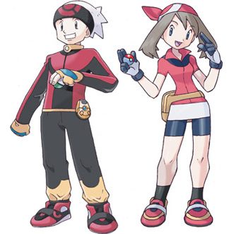
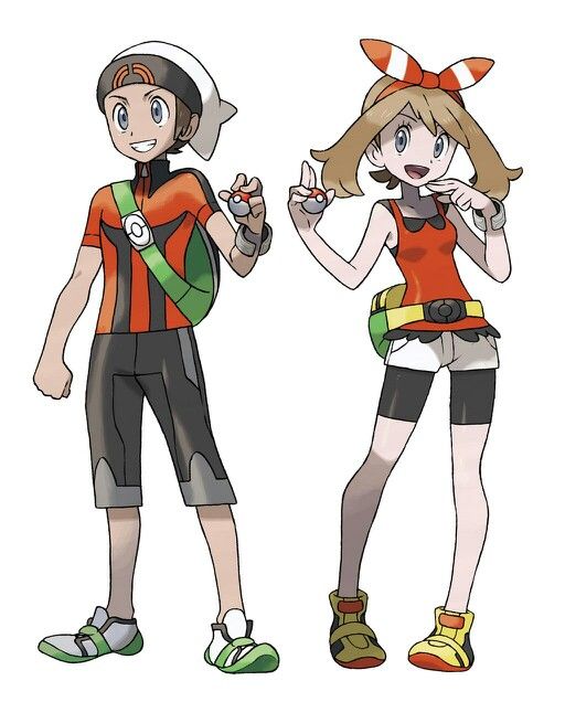
I can’t recall how many hours I spent as a child exploring the Hoenn region of Pokémon on the hunt for greatness, but it wasn’t until I was older that I discovered that the playable characters had names of their own. Brendan and May maintain similar designs between their original and remake appearances, a simple update to what we had already seen, rather than a total redesign, which, given how much Pokémon relies on the nostalgia of its aesthetic for sales, is a welcome choice.
Ratchet and Clank: 2002 vs 2016
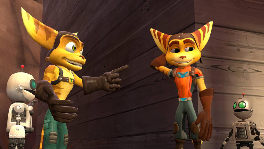
There was just something about the early 2000s that produced a number of furry critters in games. Banjo and Kazooie, Jack and Daxter, and my personal favourites, Ratchet and Clank. The 2016 remake/reimagining of the original game coincided with the release of the movies of the same name, and thus Ratchet sports an updated top, pants and boots compared to his bare-chested 2002 self, this was in an effort to maintain brand identity across the currently released titles and comes off as a bit of a cash grab, but I can’t deny he looks better with a shirt.
Dante: Devil May Cry (2001) vs DmC: Devil May Cry (2013)
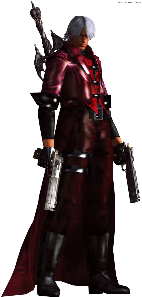

In 2013, the UK game developer Ninja Theory released a reboot of the Capcom classic Devil May Cry, which follows the legendary Devil Hunter Dante on his many adventures. The critical thing to know about the original design for Dante, is that its ethos was “to make a character who could be cool without smoking, drinking or swearing.” Ninja Theory’s rendition of Dante is…well, in the reveal trailer, he stubs a cigarette out on a demon’s face, which says all you need to know about how much they cared for the game’s original aesthetic. Dante is younger and ruder, ditches the stylish red coat in favour of a black one and loses the iconic white hair in favour of close-cropped black hair. The game’s soundscape is also switched from a mix of metal and orchestral pieces to music from the band Combichrist, showing off a common idea in the western games industry at the time to reject ‘Cool Japan’ with vitriol.
Given that Capcom resumed the original series to great success while DmC has yet to have a sequel, I think it’s clear which aesthetic turned out better…


