Today, we’re checking out some of the best and worst attempts to update the aesthetics of your favourite movies. Here goes.
Good: Casino Royale – 1967, 2006
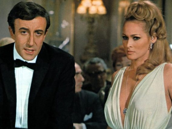
Yes, believe it or not, but Casino Royale (2006) is both a remake of the 1967 spoof of Ian Flemming’s novel and a reboot of the series after Pierce Brosnan’s final film. The original Casino Royale from 1967 is a spoof in every sense of the word, with a rotating cast of multiple James Bond actors, all of whom have a variation of the classical black tie dinner jacket aesthetic that audiences associate with 007.
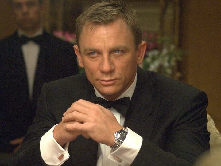
Craig’s Casino Royale is played entirely straight in the 2006 setting, where it is much darker. Bond wears a variety of gritty clothes, and the musical score has a hard edge. Put simply, this reboot updates the aesthetic of James Bond. He’s still a bombastic secret agent, but one of the 21st century, as opposed to a remnant of the past.
Bad: Mulan – 1998, 2020

Disney’s 2020 live action release made some giant leaps away from the 1998 original. Visually speaking, there’s an obvious change to the film’s feel when losing the dynamism inherent to fluid 2D animation; not to mention the change in colour palette, from the dark greens of the animated film to the deep reds of the live action.
Sadly, the remake falls flat regarding its tone and soundscape, dropping the iconic soundtrack of the original in favour of washed-out remixes lacking any of the words that made the original so memorable. Part of the aesthetic that is rarely talked about is tone; weirdly, despite the original being animated, the remake actually is less grounded. The tone and message of the original were simple but poignant: if you put in the effort, then a woman can be just as competent as a man. The remake’s message is that if you are unique, then don’t let expectations hold you back from being your best self, even if it outshines others. In this respect, it fails in its intention of making the aesthetic modernised as its overall tone is paradoxically more childish.
Good: It – 1990, 2017
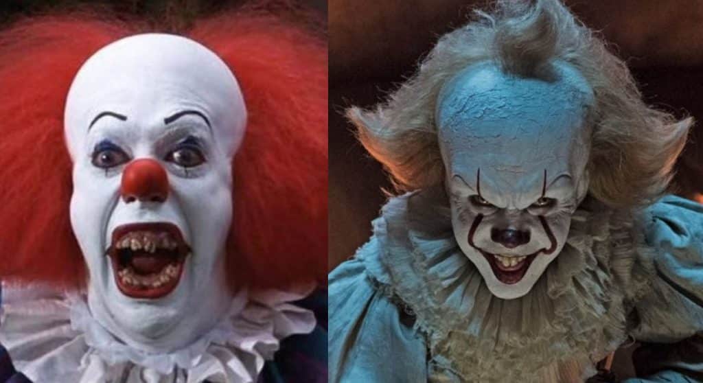
It is a seminal movie for many people, and one of the few movie adaptations that Stephen King likes. The 2017 remake provides all the bells and whistles required for a successful update to style and aesthetic. First and foremost:It‘s technology and rating. The original TV movie was limited by its budget and the fact that it was going out on TV, as opposed to the silver screen.
In the thirty years that passed between the remakes, technology had improved to the point where the producers could fully express the true, darker horrors of King’s work. It also updates the original 50s setting to a 1980s setting, an idea originally popularised by Stranger Things, meaning there is a lot more ambient pop culture to be seen and referenced, which makes it both more relatable and the darker sections more chilling.
Bad: The Mummy – 1999, 2017
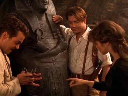
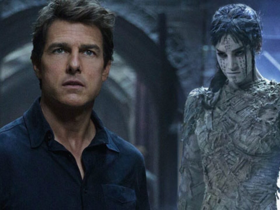
Where do I start with this travesty of a hat-tricked reboot? The botched attempt at launching Universal’s now infamously failed Dark Universe, The Mummy (2017), is a far cry from the 1999 swashbuckling Brendan Fraser outing, or the original bone-dry 1930s chill fest. This reboot took its aesthetic and stylings straight from the MCU. Enigmatic organisations in suits, a relatively bland main character in a black shirt and a series of animated enemies that are plain boring to look at, and a score that I challenge anyone to remember a single note of once the credits roll. At least Brendan Fraser’s tan pants, holster and shirt were easy to remember.


