It’s that time of year again when the shadows grow longer; there’s a chill nip in the air, and night comes in just a little faster than you expect. Autumn is well and truly here, and with it comes the most spooky of festivals that most know as Halloween. While many people may turn to dress up for scare-themed parties or go out trick or treating for sweets with those of us on the younger side, a particular facet of media reaches its zenith in the public consciousness. Horror movies there are as many types of them as people are hiding behind the pillows watching them in fright or glee. While the question of ‘what is horror’ is a hornet’s nest I will not be kicking today, it’s arguably true to say that the mechanics of how a look or aesthetic inspires fear in us.
Michael Myers (Halloween, 1979)
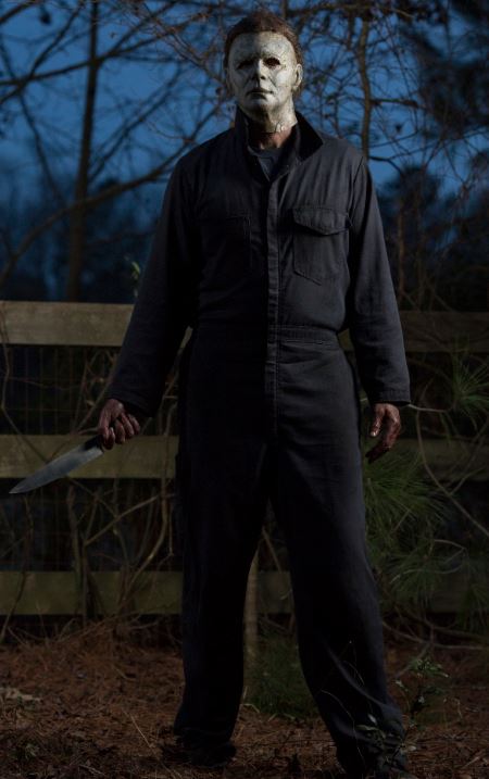
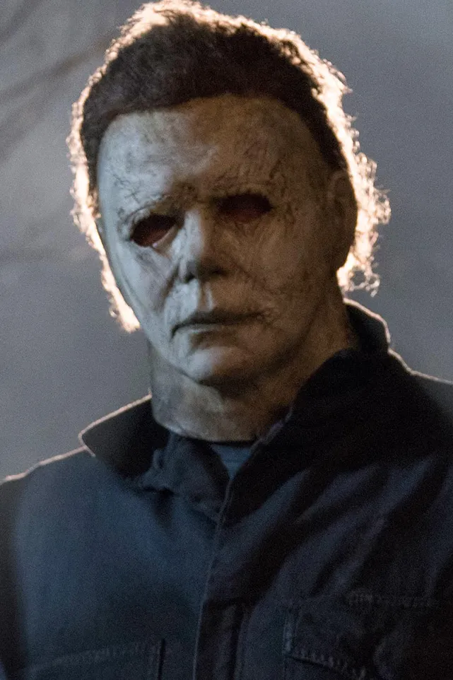
Michael Myers has been terrorising our screens since the late 70s, leading the charge of the Slasher sub-genre of horror movies. While the Halloween series chronology is something best navigated with a diagram- what with branching timelines, alternate stories and reboots- the connective tissue in all save one is Michael Myers’s simple but endlessly iconic outfit.
Consisting of a dark full-body engineer’s jumpsuit, steel toe cap boots, a chef’s knife and a mask, it is as simple as it gets and very much leans into the Haddonfield Slasher’s original nickname of ‘the Shape’. But on closer inspection, we find out that the outfit, particularly the mask, is abject. It is a white William Shatner mask depicting a blank visage with no inflexion of anger, annoyance or other human feelings. Just a shape inflicting horrors. In psychology, this is called Incongruent Affect, where emotions and actions do not match their appearance or what is appropriate for the situation.
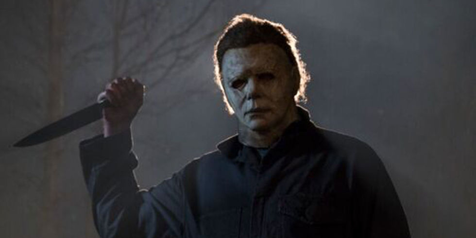
The slight lurkings of a method compound this notion to Michael’s madness; the remote head tilts he gives after each kill convey he appreciates his actions as one appreciating art, all with his aesthetic obscuring anything that could be called human emotion. Atrocity and appreciation of how he does it and repetition of the facts (his outfit) without emotion. In a sentence, we remember Michael Myers’s outfit because it captures a repeated cycle of simple evil to the point where it is iconographic.
Freddy Kruger (A Nightmare on Elm Street, 1984)
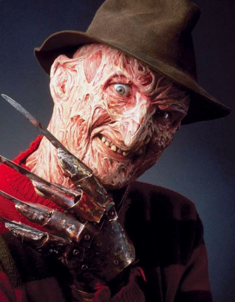
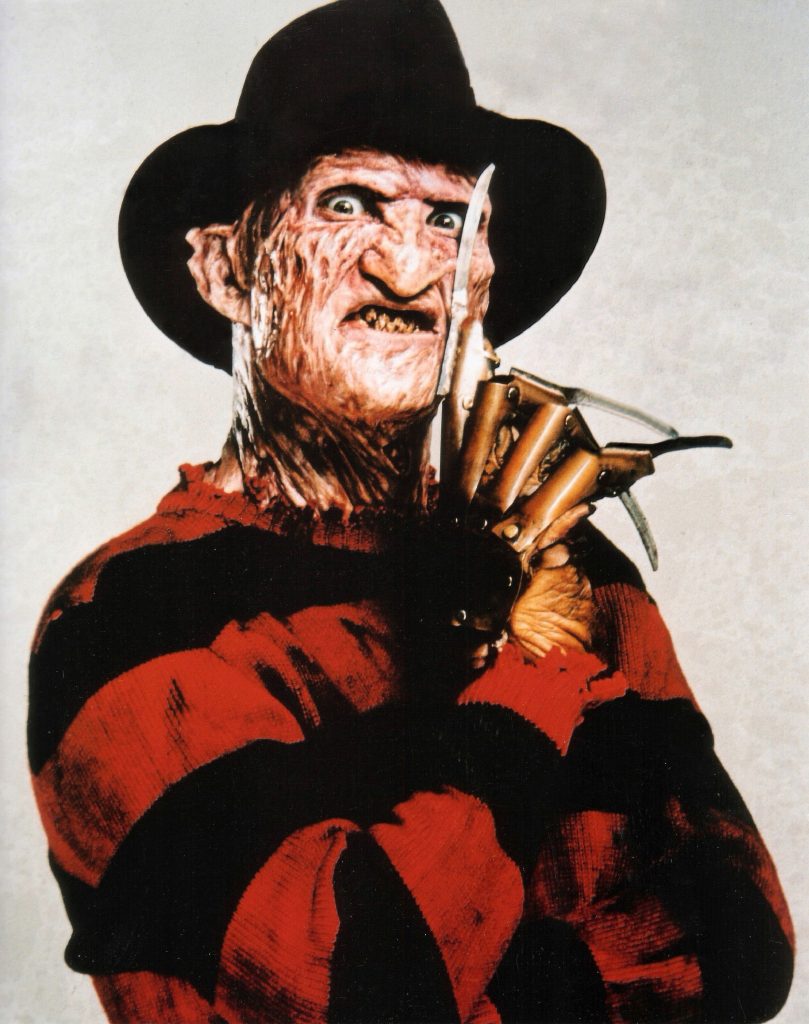
Opposite to Michael Myers, whose iconic nature draws from his lack of a discernable motivation or emotion, we have the polar opposite in Freddy Kruger. He is full of anger, vitriol, and bile and has an apparent reason for wanting revenge on the people of Elm Street. So it’s with that that his outfit and defining features are far more personable, though still as memorable as Michael.
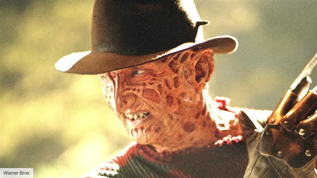
A scarred and burned body clad in a frayed red and green striped sweater, ill-fitting trousers, a wide-brimmed hat and his iconic razor-blade-fingered glove. As Freddy is an entity of dreams, he touches on the uncanny effect where his looks and outfit are typical to the point of being unsettling. It conjures half-remembered dreams of seeing a man in a hat or a man in red, primary associations that trigger the audience to think they have seen something before when, in truth, they haven’t. However, Freddy’s iconography is most associated with his bladed glove, which evokes other cues in memory, like scratches gained during sleep or the sound of nails in a blackboard, using aesthetics to trigger fearful memories.
Ghostface (Scream, 1996)
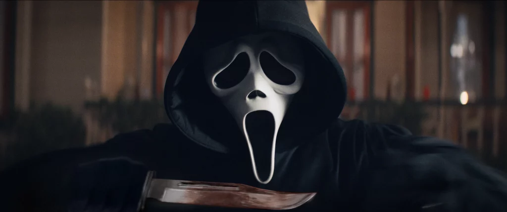
Scream straddles the line between a horror movie and a meta-commentary of the horror genre, with tropes and notions being discussed and dissected within the movie itself. Hence, the villain itself is almost superfluous. Ghostface as a monster design is straightforward, even more than Freddy or Michael, simply a man in a billowing black robe and white ghost mask.
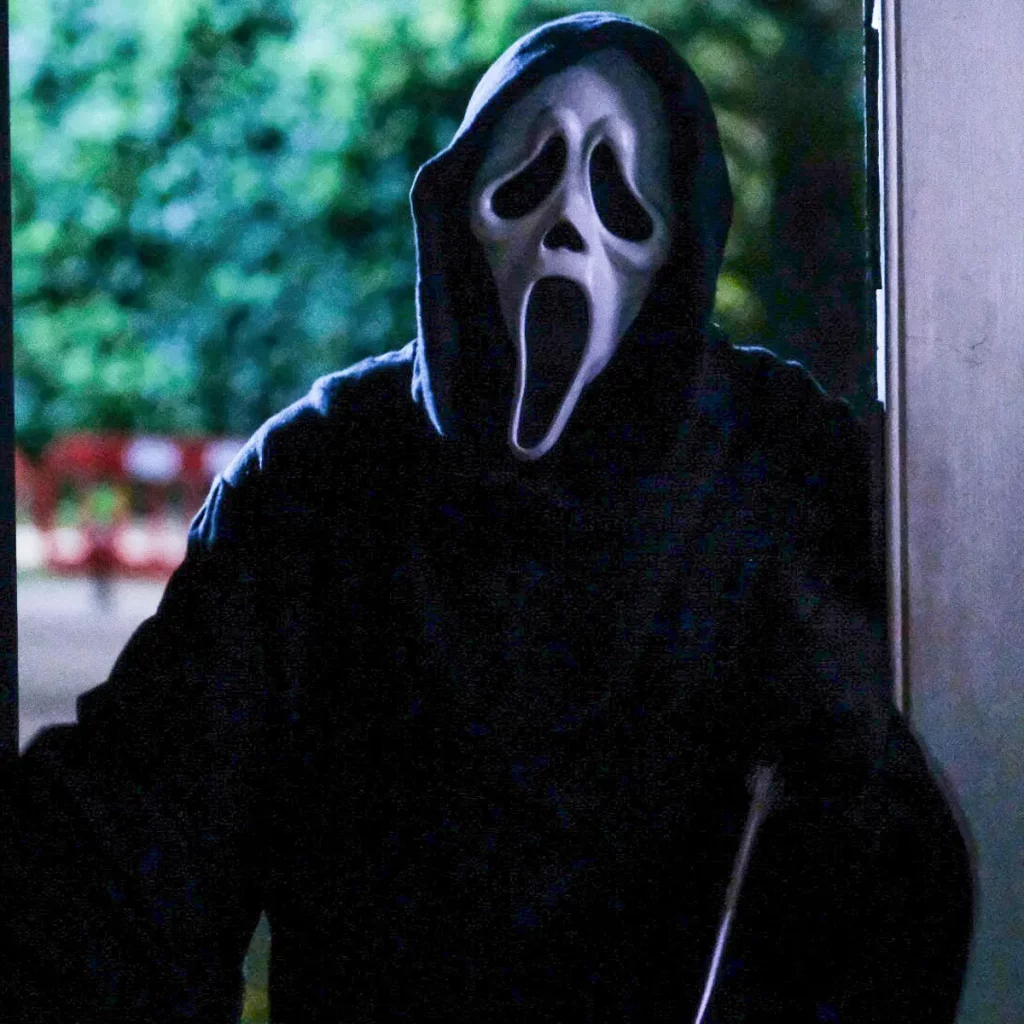
This works and sticks in the minds of the audience for a long time because it is meta to the very concept of the movie. A deconstruction of the horror genre implies that there is a monster, and its appearance can vary depending on the type of horror it is trying to convey. Ghostface’s design is so simple that it is quite literally a placeholder for “insert monster here”, a spooky ghost with a piece of iconography that can be remembered, in this case, a cartoonish white mask on a black robe. It is succinct and fills its purpose, which is why we remember it.
Pennywise (It, 2017)
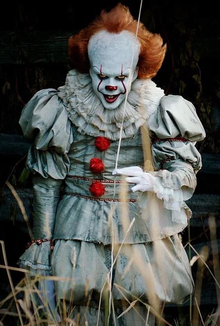
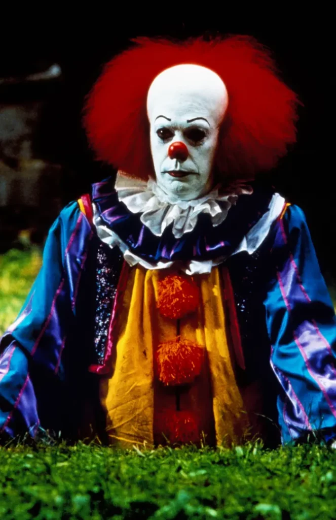
Clowns. I and a good percentage of the planet are not fond of them for various reasons, and probably the most well-known evil clown of all is Pennywise the Dancing Clown from Steven King’s It. While Tim Curry’s 1980s portrayal of the eldritch horror is iconic for many reasons, the aesthetic and outfit design discussed here will be Ben Skarsgard’s 2017 rendition of the Macroverse Dead Light Denizen. Skarsgard’s Pennywise sports a one-piece clown outfit in silver with red bobbles running down the front, a ruffed collar, ruffled cuffs and a painted white face. Moreover, Skardgard’s head notably distends into a lightbulb shape with gravity-defying orange hair. The outfit design was noticeably sagging and tarnished, showing that it is not pristine, lending to a mouldering effect in line with Noel Caroll’s idea that monsters are festering things that come from rotting places.
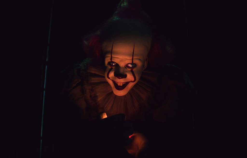
Moreover, it’s another usage of incongruent affect born of the painted smile, the clown doing horrifying things despite his appearance implying something that brings amusement. Lastly, the juxtaposition of colour is used to draw the eye, the red standing out on silver clothes while the pale face draws the eye to Pennywise’s orange eyes, which are deeply unsettling. This multitude of factors comes together to make the clown’s aesthetic something that inspires fear in the watcher.
Asami Yamazaki: Audition (1999)
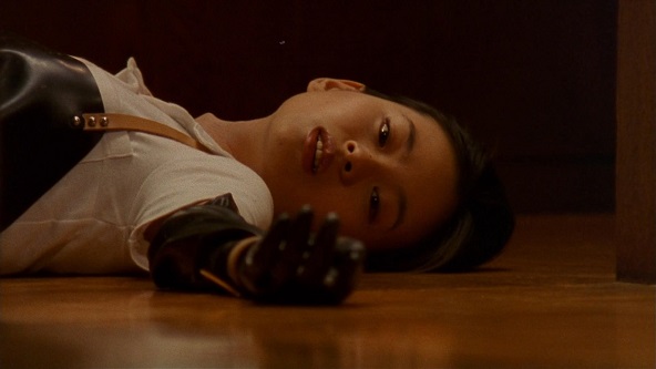
Bit of a swerve for the last point of discussion here, but it’s nice to bring a splash of J-Horror into a list dominated by western movies, and for the record, Audition is a very unsettling film that is well worth the watch. Asami Yamazaki is the main antagonist of the 1999 psychological horror and a curious mix of cultural ideas of horror. To not go too far into spoiler territory, Asami is a beautiful, if mentally unwell, woman who makes a sport of tricking men into relationships with her only for her to torment them after a perceived slight. She sports long dark hair and predominantly simple white clothes -mainly t-shirts and skirts-though upon transitioning to true villainy dons a black rubber butcher’s apron and bicep-length latex opera gloves.
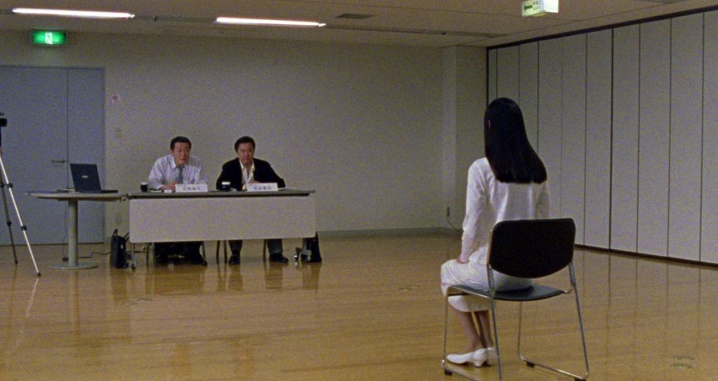
This look juxtaposes her seemingly banal clothing and the sensual, sultry associations that society has with latex, touching the border between erotic and horror filmmaking, which share a kinship in being the only two types of film that excite a physical reaction from their viewer. On the other hand, there is the Japanese stance on horror to take into consideration. The image of a woman clad fully in white might be a sign of purity in the west, but in Japan, it is analogous to a Yurei, a vengeful ghost. At the same time, the monochrome ensemble plays with J-Horror’s use of optics, drawing the eye even when she is only partially on screen.


